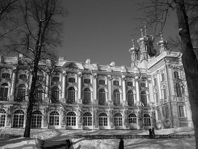

Someone with more photographic skills than I (Suby) suggested straightening one photo and making another b&w and sharpened. Your wish is my command. Thanks for the suggestion. What do you think? (Original posts --still posted-- are from Monday April 24.) Precise information on the palace from Nina: "That blue palace is called Tzarskoye Selo. It is outside of St.Petersburg. It is where Amber Room is. The building which is attached to the palace is called Tzarsko-Selsky Litsey. Alexander Pushkin graduated from it. "


 Someone with more photographic skills than I (Suby) suggested straightening one photo and making another b&w and sharpened. Your wish is my command. Thanks for the suggestion. What do you think? (Original posts --still posted-- are from Monday April 24.) Precise information on the palace from Nina: "That blue palace is called Tzarskoye Selo. It is outside of St.Petersburg. It is where Amber Room is. The building which is attached to the palace is called Tzarsko-Selsky Litsey. Alexander Pushkin graduated from it. "

6 Comments:
It looks just as good in B&W!!
I didn't saw the old ones but those two are just great!
I am always in favor of colorfor this kind of pictures! And I love gold ! ;-)
I think the b&w is perfect. I find that the bottom photo suffers from to much foreground. The tree in the corner and the grey box on the left are somewhat distracting. Unfortunately, the building is so huge that you probably couldn't move much closer.
The building has great colours, but I actually prefer the B&W due to the number of details and shadow on the exterior. Great work!
Fraser,
Now this is better. The monochrome shot is spot on. The details in the shot just stand out and draw you into the shot. I have both the B&W and colour pictures open here and the difference is definitely clear. Looks like a picture from a classy film or book. This shot is one to die for The Subster now LIKEY.
Now to the colour image, I would clone out the bin(or whatever that is) to the left of the pic. Timmybomb says it suffers from too much foreground, I sort of think it does. Rule of 3rds not followed here, the focus is too central in the shot. I think it looks better straightened though. All in all a big improvement from the original.
Goes to shot how much just a little editing tweeks can help ENHANCE an image. Good one bro.
The B&W version of the top picture is stunning but for me, the colour version of the same image is a winner.
Post a Comment
<< Home